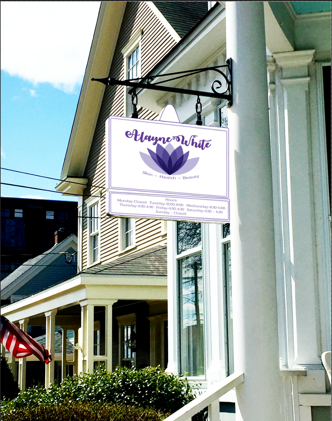
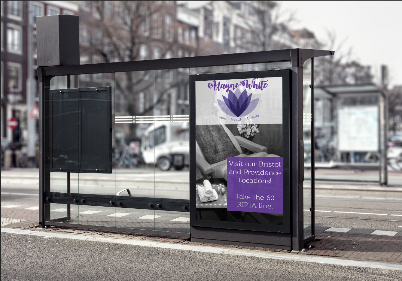
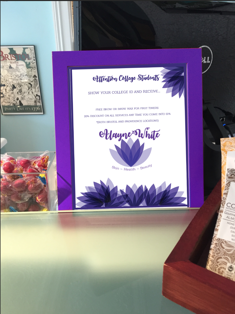
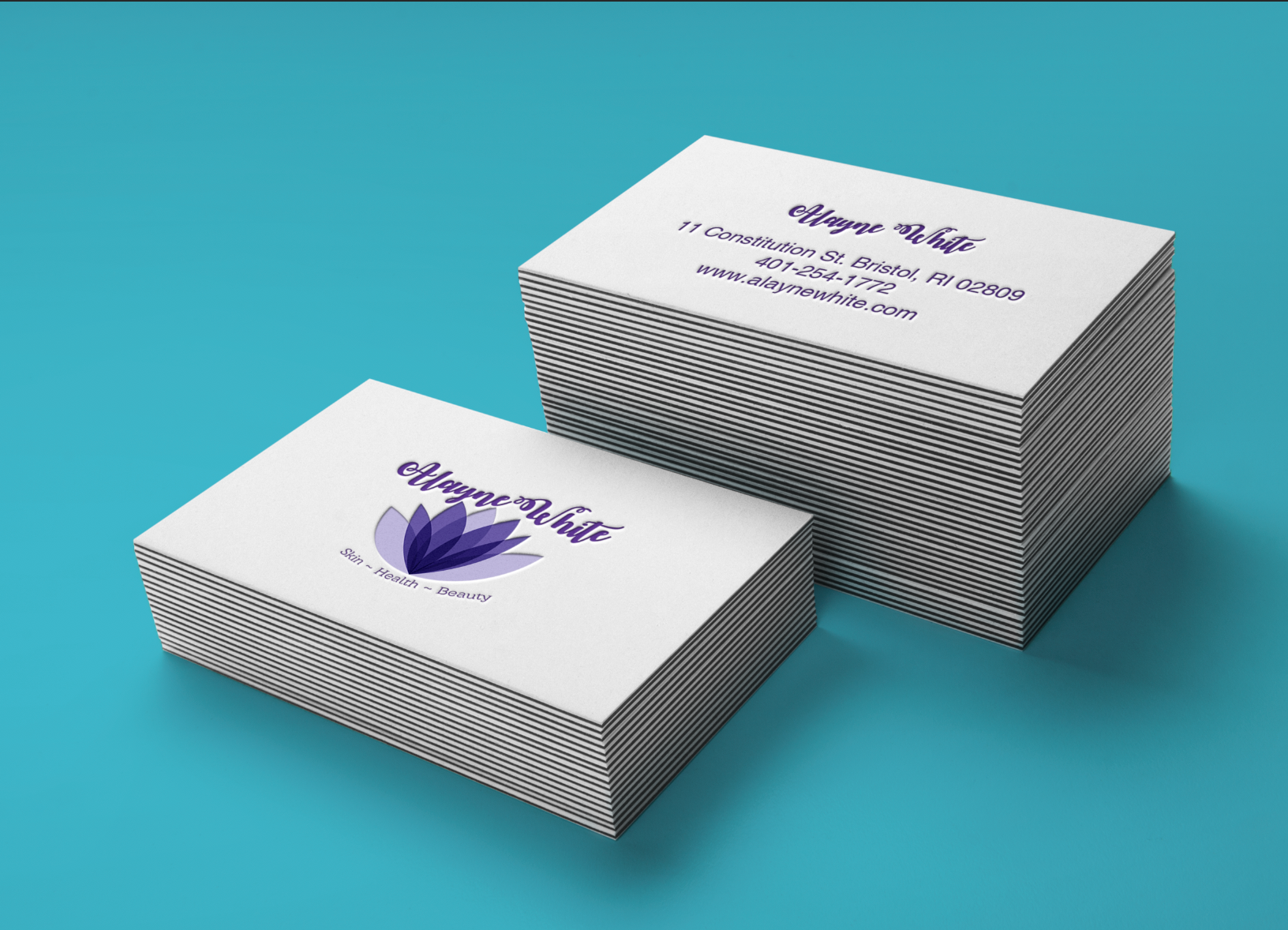
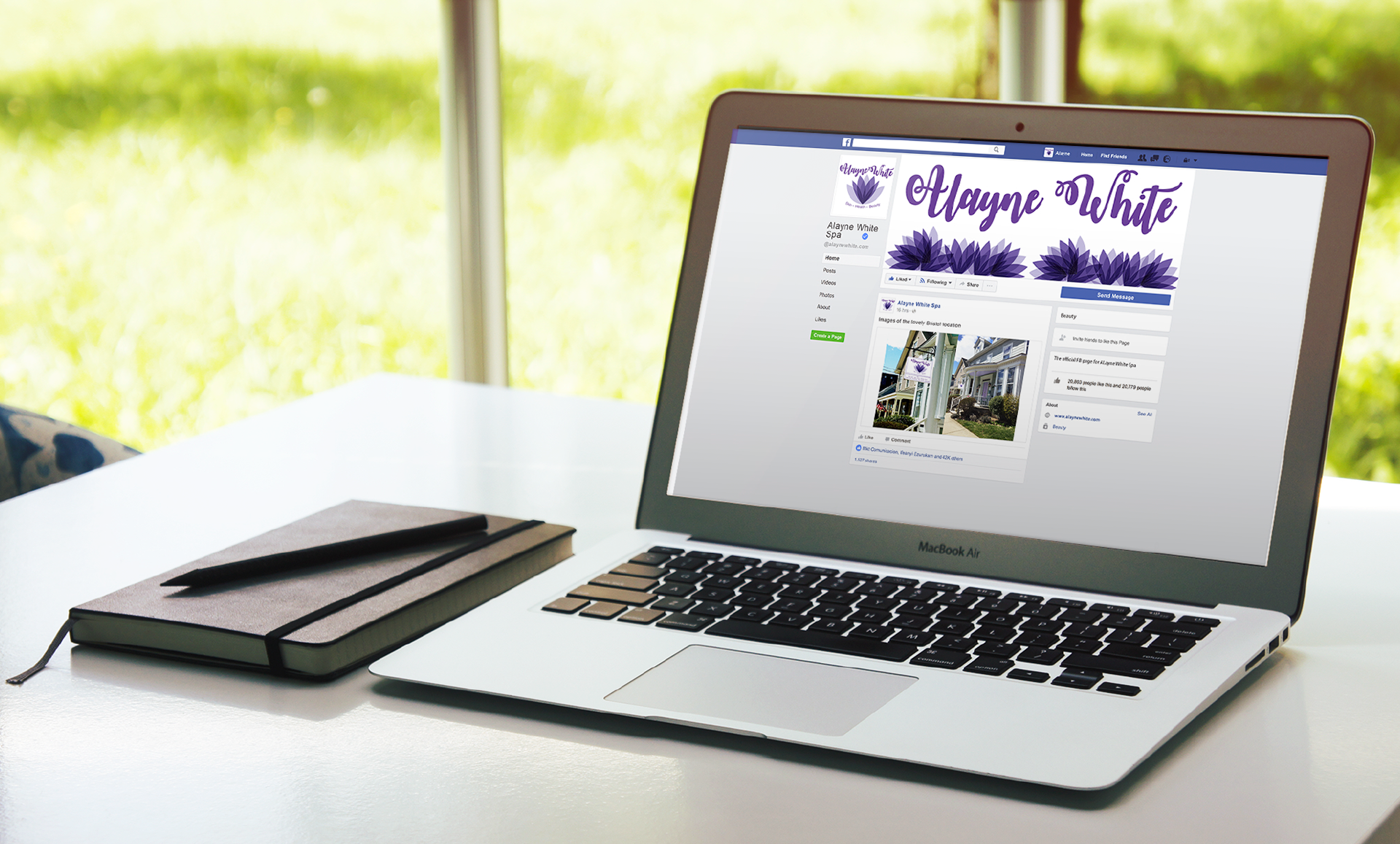
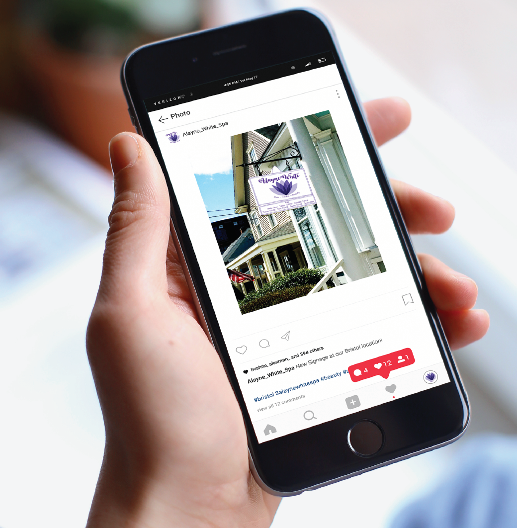
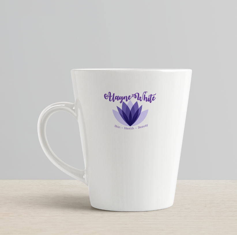
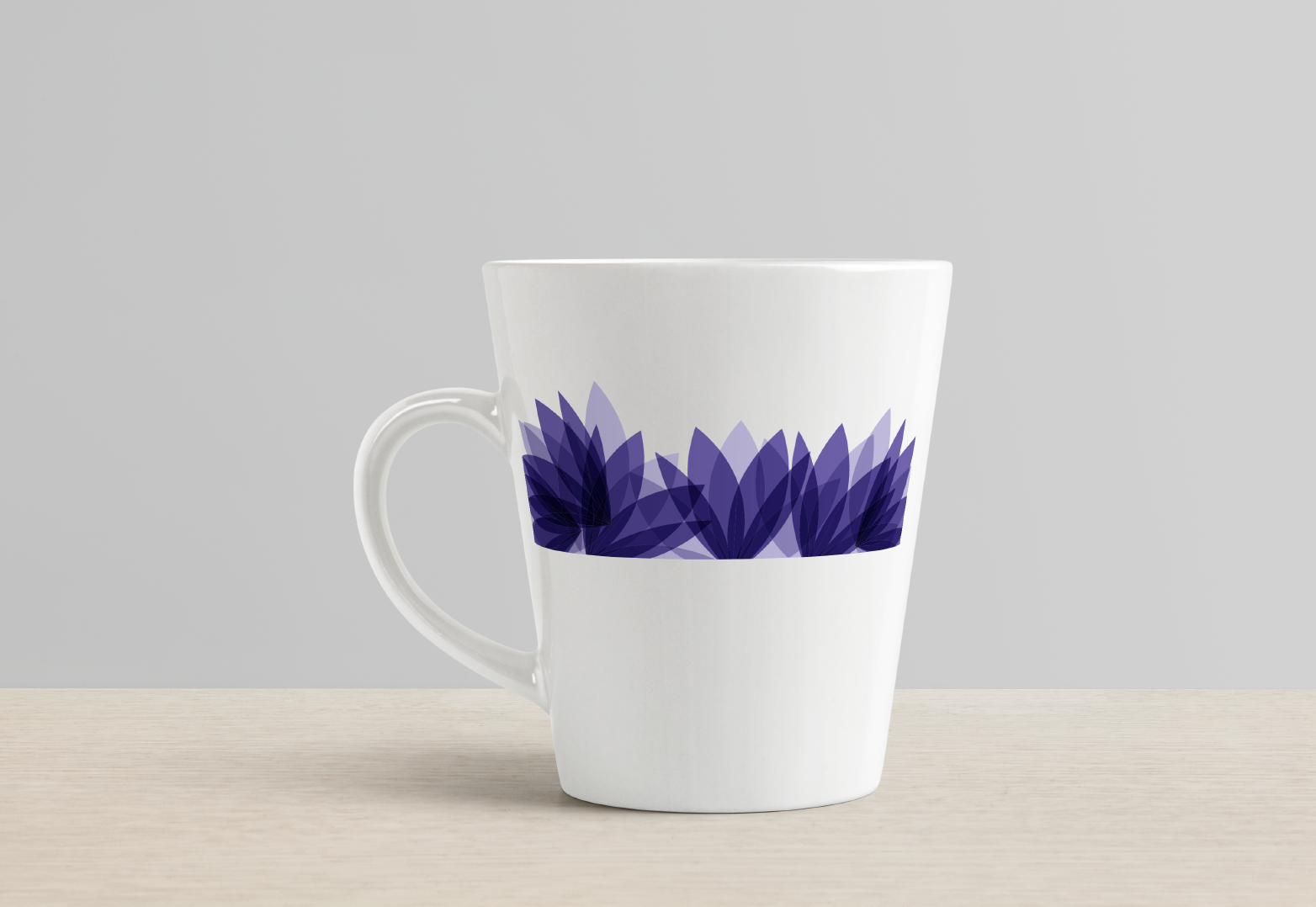
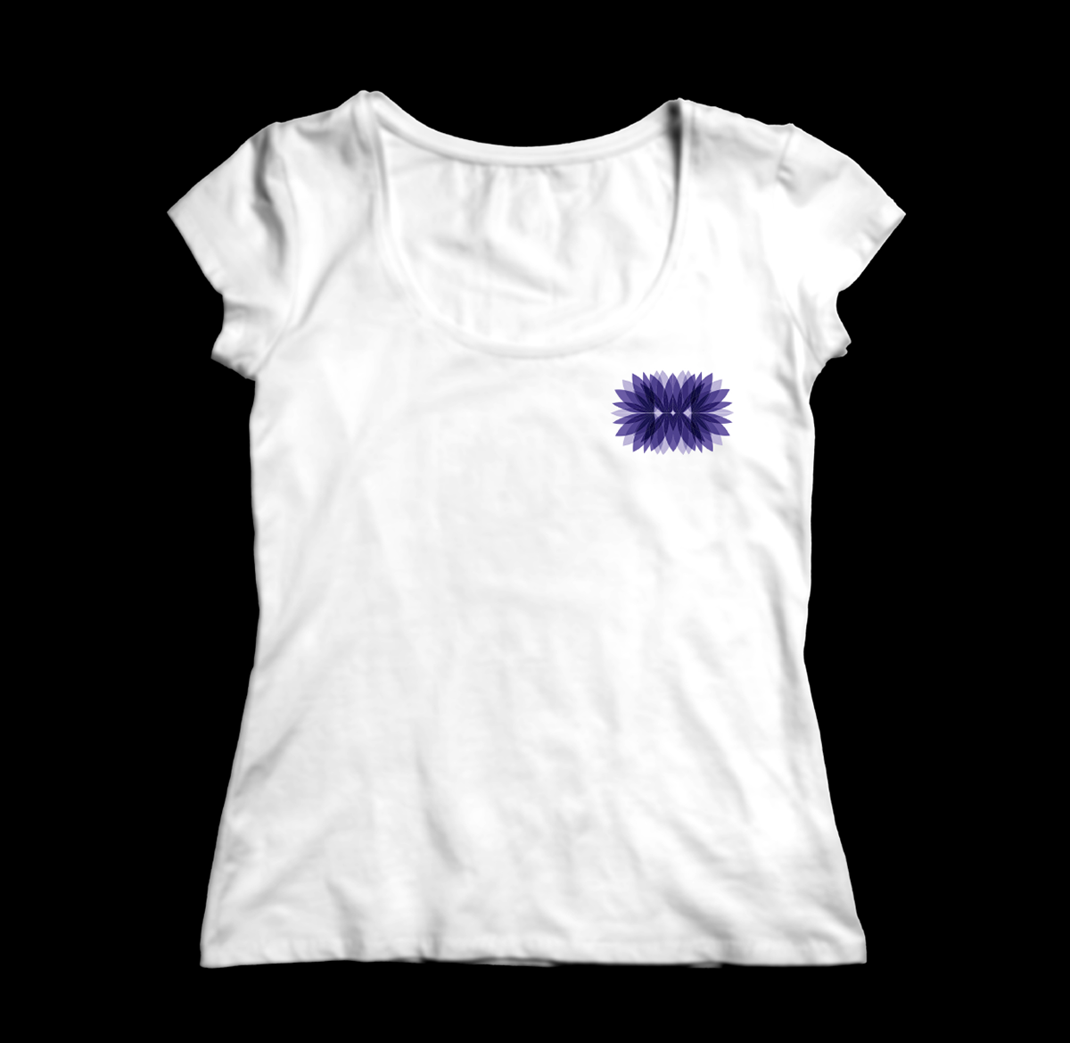
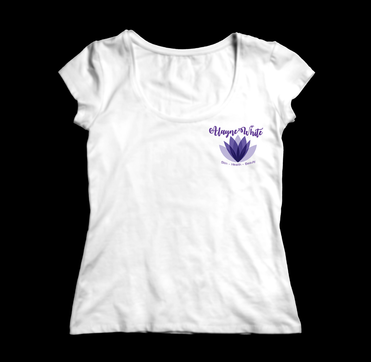
For this project, I created a hypothetical rebrand for a local spa in Bristol, Rhode Island, called the Alayne White Spa. I met with Alayne to learn more about her and her company. Based on our discussion I decided to re-vamp her original look and feel. Her logo had been an emoji-like logo with a lotus flower. I liked the concept of the lotus flower because it symbolizes purity. I thought that was a good representation for a spa because of their relaxing nature. I chose the lavendar colors because they also represent a calming vibe. I decided to keep the name of her spa as is, but rather focus on the new color, typeface, and flower. The typeface I used for all body text was “Baketina Test” and the headers were in “October Twilight”. I created a logo, brand book, posters, social media, store front sign, T-shirts, mugs and much more. Even though this rebrand was hypothetical, I was able to learn a lot as a designer about the process of creating a new identity for a company. (2018)